

HOSPITALITY BRAND IDENTITY
The Aurelian
Making it feel like the best part of the building.
ROLE
Brand & Creative Director
CLIENT
Elecor (formerly Paramount Group Real Estate)
VENUE
The Aurelian - 1301 Avenue of the Americas, New York
YEAR
2026
SCOPE
Naming (The Café) · Logo & wordmark · Sub-brand system · Brand guidelines · Signage & wayfinding · Digital displays · Menus · Collateral & merchandise
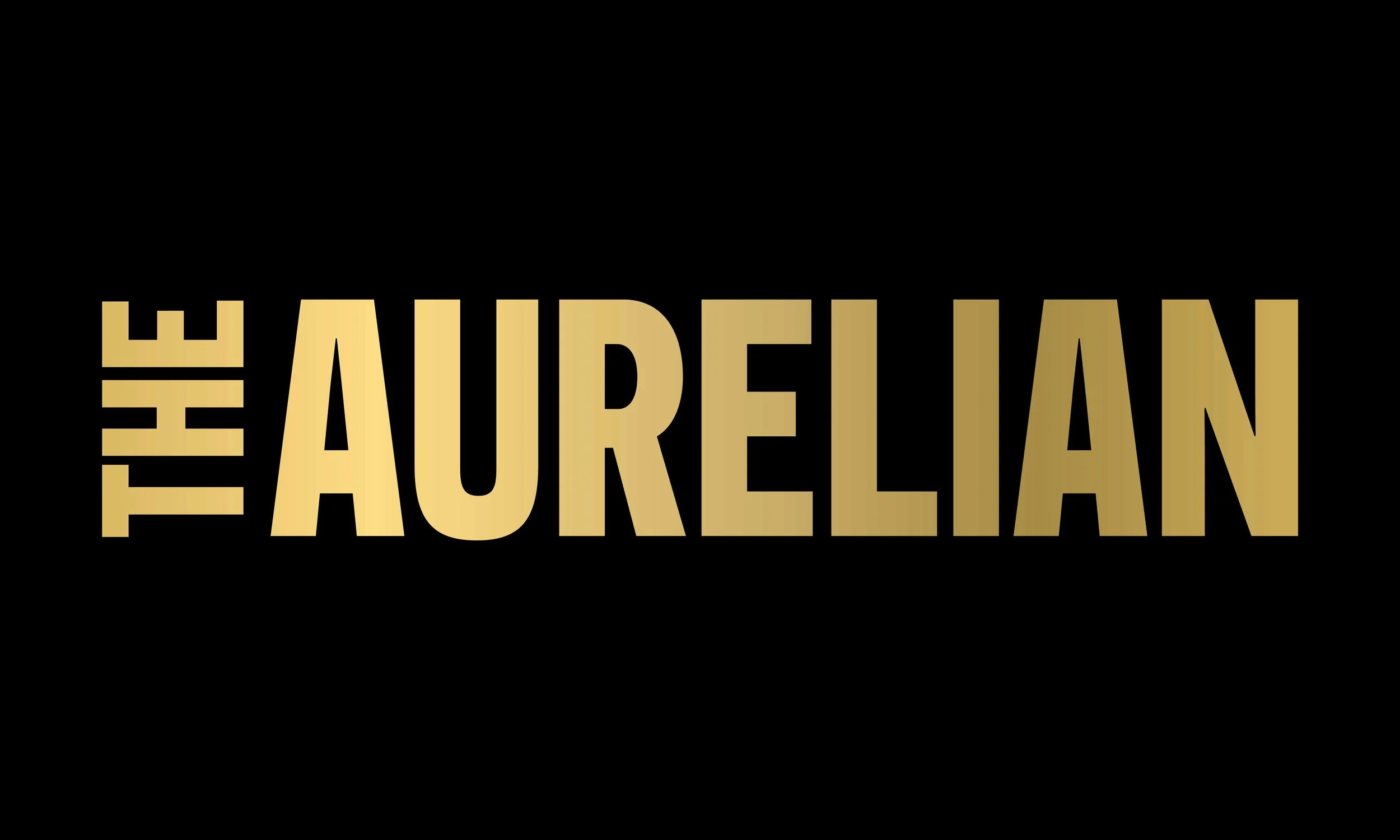
The Aurelian is a hospitality amenity, work in one of the buildings and you're in. Hospitality, wellness, dining and community, already included. That's a particular kind of brand problem because nobody has to buy in, so the brand has to earn the walk-in. The identity it had didn't. It was thin, cool, and read like commercial real estate rather than somewhere you'd choose to spend an hour of your day.
THE BRIEF
When Paramount Group was acquired and became Elecor, the Paramount Club lost its name overnight and became The Aurelian. My job was to give the new name an identity that felt like the best part of the building, not the landlord's amenity.
It started with weight. A heavy, confident wordmark in place of a thin, wide-tracked mark that had read as the landlord’s signage; elevated but never exclusive, which is the line hospitality always has to walk. Everything downstream follows from it.
THE MOVE
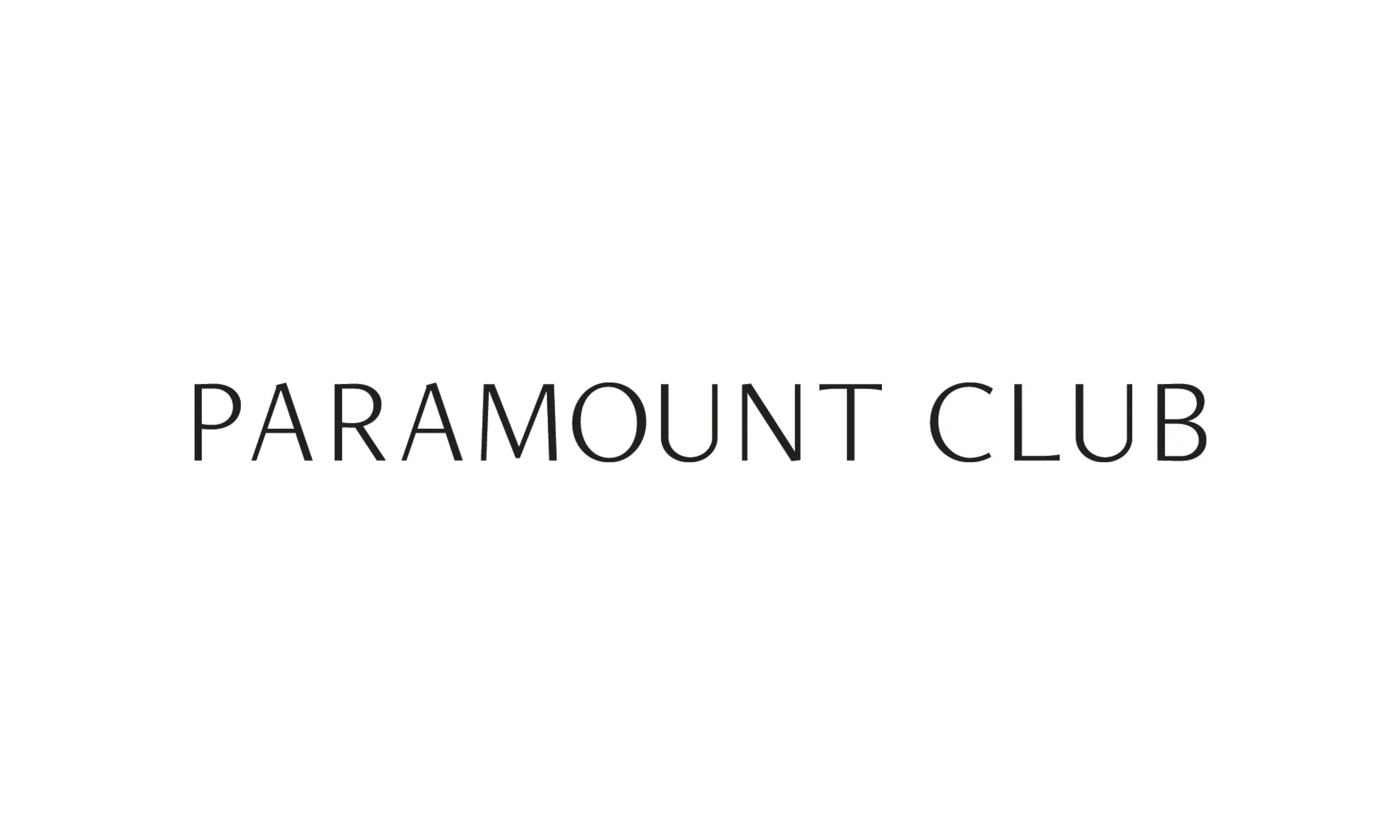
The Paramount Club: the identity as inherited
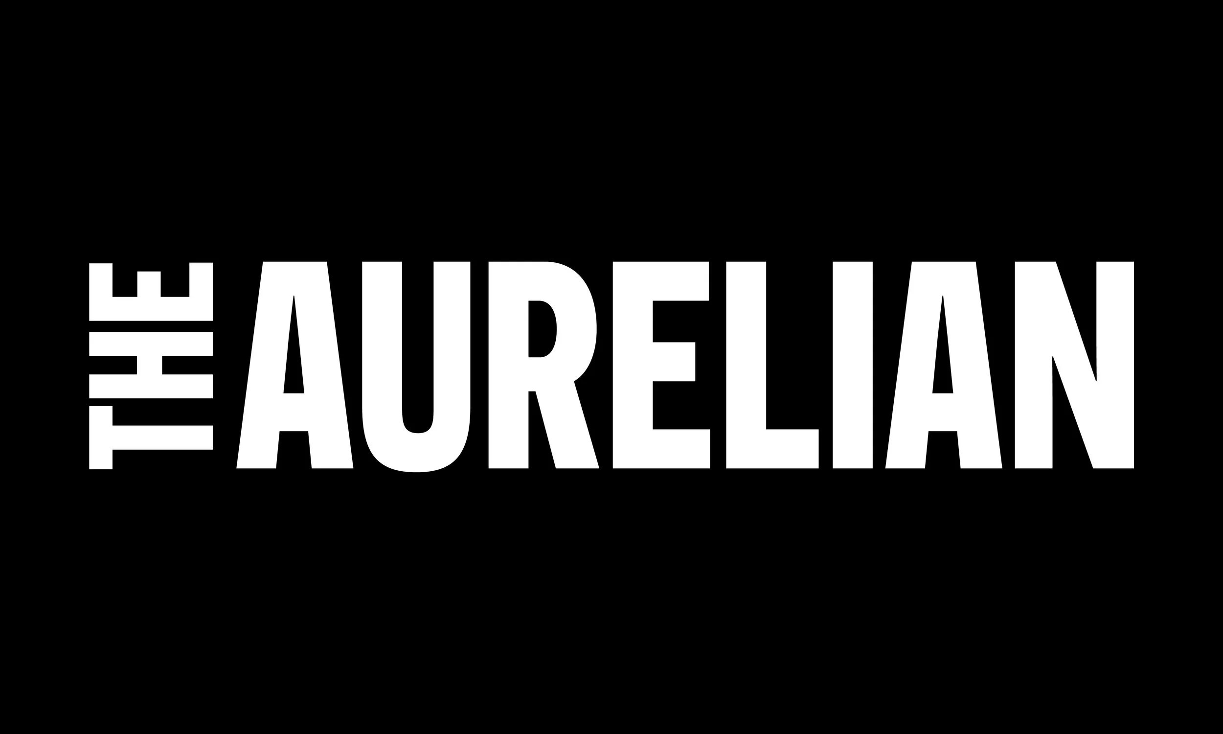
The Aurelian: the new wordmark
The mark is drawn from the A in the wordmark. Mirrored and repeated, the letterform locks into itself; a chain that reads as a monogram at small size and as a pattern at scale. That double life is what makes it work: it is a pin on a lapel, and it is the texture running across menus, cards and signage.
THE MARK

The mark: the A, mirrored and locked into itself

Tiled: the pattern on cards, paddles and signage
The spaces themselves didn't change; same rooms, same furniture. What changed was what they were called and how they announced themselves. I recommended the name The Café; it was adopted. Both it and The Wellness Center got their own wordmark, drawn on the same typographic thread, so every venue reads as a destination in its own right and unmistakably as part of the club. I drew three wordmarks, but what I handed over was the rule so spaces that come later have a system to join rather than a precedent to guess at.
THE ARCHITECTURE


One thread, three names: the shared typeface is the system
Hospitality is the part of a brand people meet in person. The pin the team wears on the apron or collar, the welcome signs at the door, the menus handed across the bar; these are where the club stops being a logo and starts being a greeting. I designed that layer as carefully as the mark, because it’s the one members actually touch.
FRONT OF HOUSE
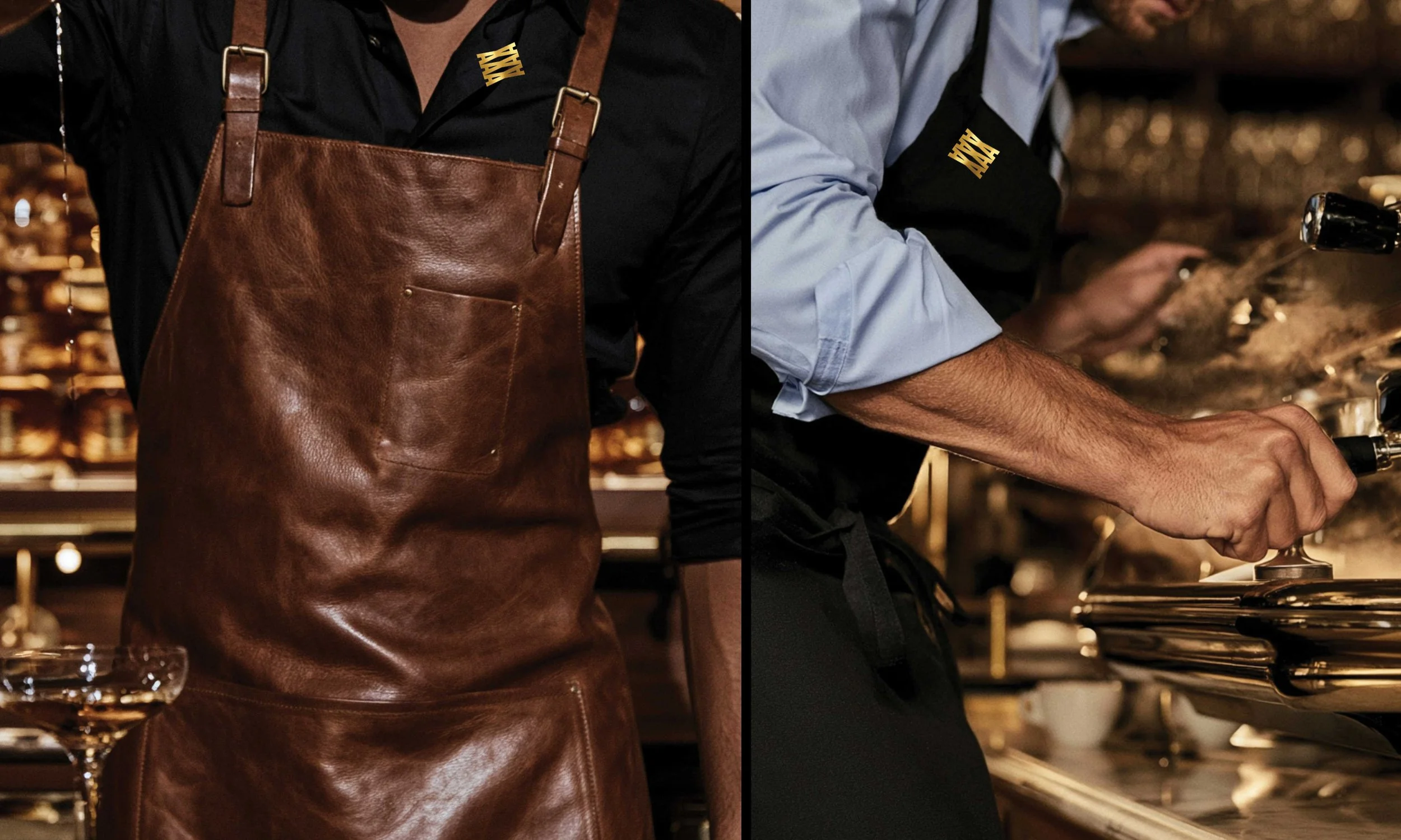
The uniform: the brand worn, not just displayed
The system had to hold up everywhere members and staff actually meet the brand: menus, indoor and outdoor signage, a full digital sign program, paper goods, swag, and a pin the team wears front of house. I documented it as brand guidelines so it could be executed consistently by internal teams and outside vendors.
THE ROLLOUT
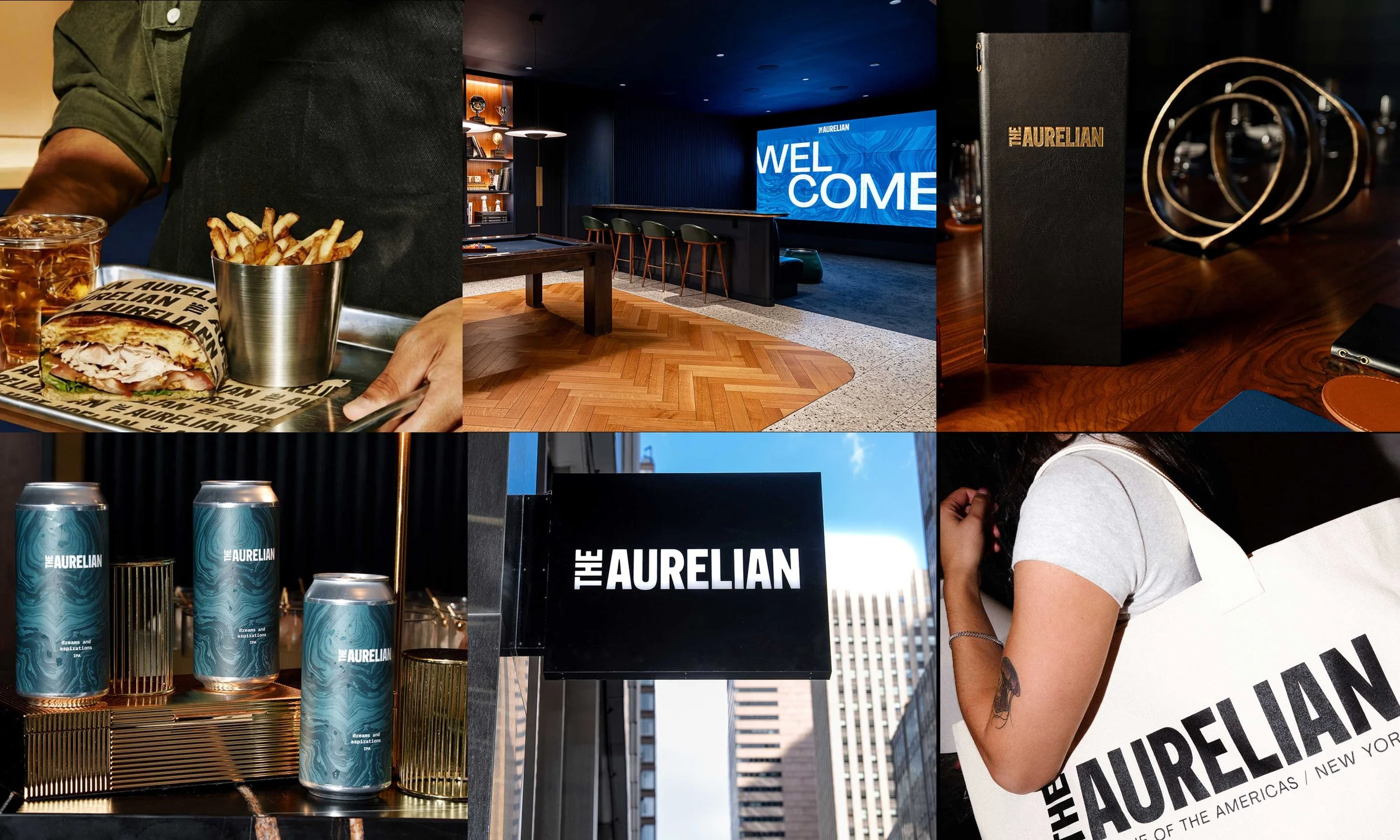
Uniforms, signage, service, print and merchandise: one system across every touchpoint
30
projects in the first rollout
500+
RSVPs in the first hour
Sold Out
in under a week