

WORKPLACE ENVIRONMENT & NAMING
ExecOnline DC
A workspace that could only be in Washington.
ROLE
VP, Creative
CLIENT
ExecOnline
LOCATION
Washington, DC
YEARS
2022-2023
TEAM
Creative team of five, I built the function up from one
SCOPE
Workplace environment · Naming system · Mural commission & art direction · Signage & wayfinding
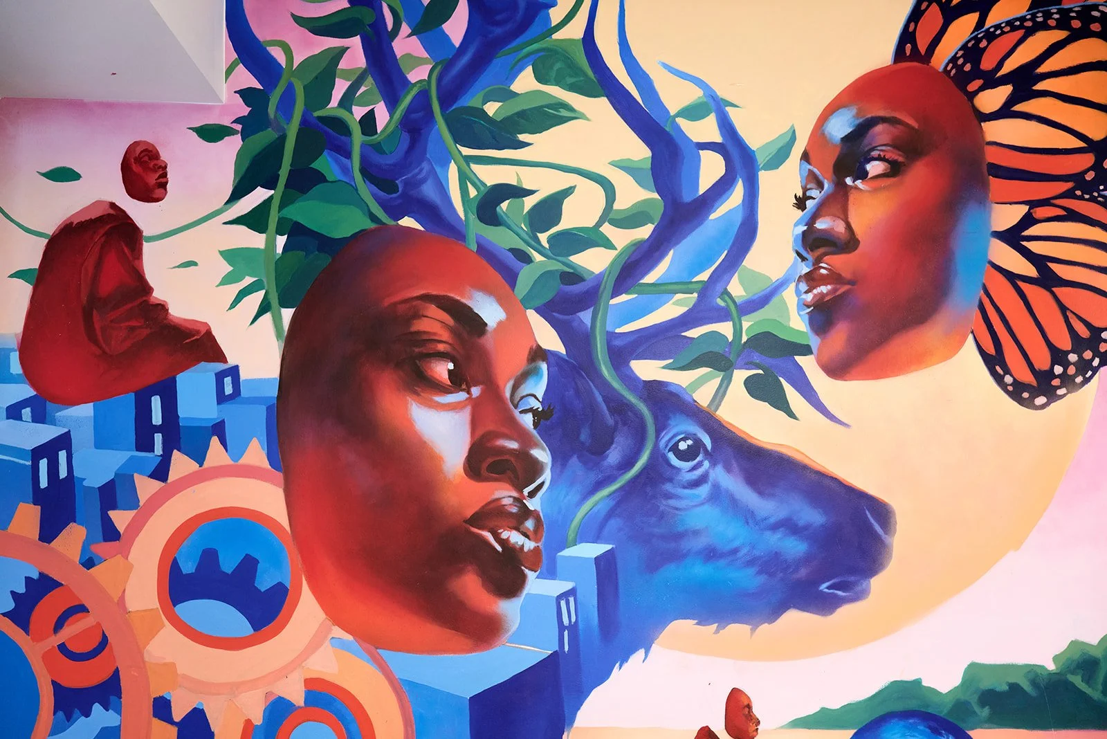
Mural by Aniekan Udofia, commissioned for the DC office.
An office fit-out normally goes to an architect and a furniture vendor, and the brand turns up at the end as a logo on the wall behind reception. The DC office could have gone that way.
It didn't, because ExecOnline an online professional education company that provides B2B leadership development and coaching programs for mid-to-senior level managers and enterprises. The office is one of the few places it exists as a place rather than a platform, and if the room feels generic then so does everything that happens in it.
So I argued the office was a brand project. Nobody had asked for that.
THE BRIEF
The decision was to make the office from Washington rather than in Washington.
That sounds like a small distinction and it isn't. It settles everything downstream: whether the art is bought or commissioned, whether the rooms are named or numbered, and if someone walking in for the first time learns anything about where they are.
A room called 3B could be in any building in any city. That was the whole argument.
THE MOVE
I named the conference rooms after DC neighborhoods Adams Morgan, Georgetown, Dupont Circle (this neighborhood is where ExecOnline was founded).
Other names included: Capitol Hill, Navy Yard, U Street, and the National Mall. The names were approved by the DC team and they added a few of their favorites.
Naming is the cheapest brand work there is and by some distance the most durable. Nobody repaints a room name. It goes into calendar invites, into how people give directions, into how someone describes their afternoon. Within a week the names stop being a design decision and become the way the building talks about itself.
THE NAMING
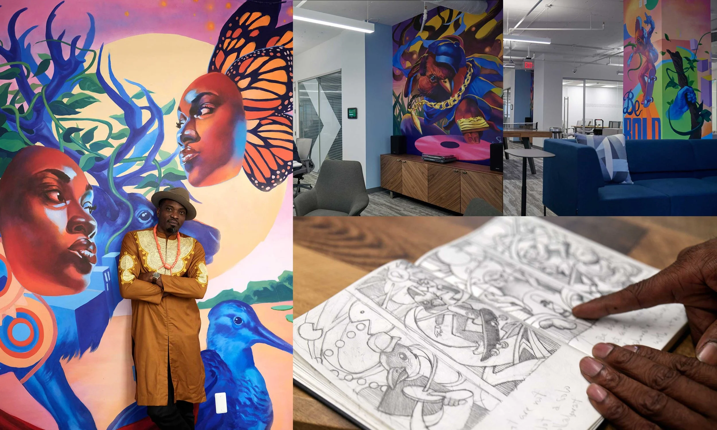
Aniekan in the first photo taking pride in his work, the DJ was strategically placed to pull you from one side of the office to the other, there were several smaller murals painted on columns to bring the company pillars to life.
The largest surface in the office went to somebody else.
I commissioned Aniekan Udofia, a muralist already known for his work in DC. I spent days walking around DC, looking at murals and reaching out to Aniekan. When we spoke about the project, creating and painting 5 murals, his enthusiasm and ideas blew me away. Leaning into nature, the humanity behind the technology and the people using the space, bringing them together.
That's a decision worth defending, because the safe version was a printed graphic I could have controlled entirely. A commissioned mural is slower, let alone 5 murals, costs more, and the finished pieces aren't yours. What it buys is a piece that belongs to the city the office is in, that no other company can have and an artist whose name means something locally, attached to ours.
My job on it was the brief and the standard, not the drawing.
THE COMMISSION
This is where the creative function stopped being a service desk.
When I arrived, it was one person making presentations. By the end it was a team of five; shooting video, building brand systems, running events, designing space. The DC office is the clearest evidence of that, because it's a job that wasn't on the list when I started. Nobody thought of the office as something design touched.
Widening what a creative team is allowed to work on was most of what I did there. The mural is what that looks like on a wall.
WHAT IT CHANGED
1-5
7
1
creative team, built up from one person
rooms named
mural artist, Aniekan Udofia
Anyone can put a logo on a wall. The question is whether the room could be in any other city.